
PepsiCo Unveils New Logo and Corporate Style for the First Time in a Quarter Century
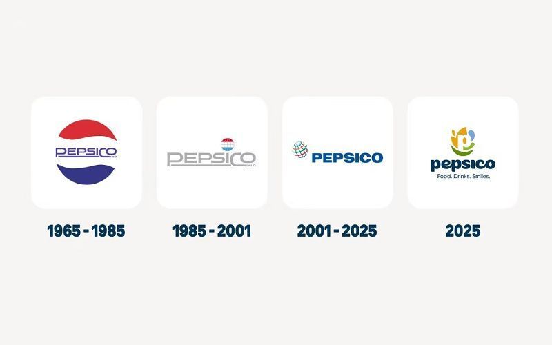
The new logo consists of a white letter 'P' surrounded by shapes in orange, green, lime, and blue colors, symbolizing the company's main areas of activity. Below it is the new slogan — Food. Drinks. Smiles.
According to the press release, the yellow color represents the 'food and agriculture' direction, blue signifies 'water and beverages,' light green symbolizes 'positive impact on people and the planet,' and the dark green crescent ('smile') emphasizes the company’s focus on the consumer.
'Today, we proudly present a new brand identity that reflects who we are now and the future we are building together. It is more than just a logo — it is a symbol of transformation, reflecting the energy, optimism, and ambitions of PepsiCo in 2025 and beyond,' the company statement reads.
PepsiCo notes that its history began 60 years ago with the merger of the Pepsi and Lay’s brands, and today its portfolio includes Tostitos, Gatorade, Quaker, Siete, Poppi, and dozens of other brands. The total number of employees exceeds 300,000 people.
'Despite the growth and changes in our business, our corporate brand remained unchanged for almost 25 years. Today we present an identity that unites our entire range and reflects our development,' PepsiCo emphasized.
The company noted that the chosen color palette is inspired by the real world — 'fertile soils, refreshing drinks, and bright shades.' The new font is intended to convey a 'sense of accessibility' and reflect the 'bold, consumer-oriented spirit of the brand.'